|
Much has been written about colors and trim patterns
that assist in preventing our model airplanes from being lost from flying out of sight against a blue
sky or against a background of white, puffy clouds. Free flighters are particularly concerned about
such things since their models are at the mercy of air currents. Even dethermalized models can be whisked
away, never to be seen again, when a boomer of a thermal or a strong gust of wind asserts its influence.
As a flier of radio controlled sailplanes, I can attest to the tense moments when suddenly a model at
great altitude transitions from visible to invisible. Down elevator and rudder trim is the best action
to set up a spiraling dive until eye contact is made once again. This article from a 1954 edition of
Air Trails takes a very scientific approach that includes empirical data to assist you in selecting
colors and trim schemes. Of course the individual characteristics of the pilot's eyesight is a major
factor that needs to be factored into the data. As with most things, you try suggestions and test the
results to see what works best for you. At lest this is a good place to start.
For Model Airplane Flyers:
Free Flight Color and Visibility Chart
By Dr. Stanley D. Hill
Member 1953 U.S. F.A.I. Gas Team
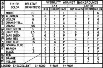
This chart is presented to emphasize and clarify the most neglected phase of free flight contest
model design - Visibility. Proper use of color for maximum visibility is as much a part of the design
of a high-performance job as selection of engine or airfoil. To make a model of outstanding design and
construction and then fail to use its full contest potentialities because it is difficult for the timer
to see it for a maximum flight is as. pointless as flying with the prop on backwards.
As an example, Ted Evans of the '53 British Wakefield team had one of the best built and certainly
one of the best flying models at the international Cranfield meeting. Yet on his first flight the ship
was timed for only 4:32 o.o.s. (out of sight) directly overhead simply because it was mostly white.
His second and third flights were both "maximums," so he would have been a co-winner of the Wakefield
Trophy except for this poor color choice.
So use a color scheme that enables the model to be seen as long as possible by the timer, and one
that aids prompt retrieving. Let's analyze the problem point by point.
Color Contrast
Two factors concerned with the model itself are contrast with background and image size. Taking contrast
first, we find that it presents itself in two forms: brightness contrast and color contrast. Brightness
contrast may be either light on dark or dark on light. To be seen as separate from its background an
object must present a 1% brightness difference within the eye of the viewer.
For our purposes light on dark provides the most usable combination since, with sufficient brightness,
an object of any size however small or distant can bring about the required 1% difference. For example,
the nearest star subtends an arc of only .056 seconds, while a dark object on a light background requires
from .44 to 6 seconds of arc for detection, depending on color. It follows from this that to be just
visible a dark model on light background must be larger or closer than a light model on dark surroundings.
Control of color contrast is the thing most easily achieved in finishing a model for high visibility.
The colors used must contrast with the natural backgrounds of blue or gray sky, white clouds; and the
greens and browns of the earth. The reds, oranges and yellows are the only ones that possess effective
brightness and any reasonable contrast with all probable natural backgrounds.
The disadvantage of blues, greens, etc. is obvious. To contrast a model with itself by means of stripes
or different colors on various parts of the ship defeats its own purpose, since visibility is a problem
only when the model is very far away and distinguishable as just a spot - a spot of diluted color due
to blending of these patterns at a distance and therefore of lowered contrast. Also, less area is available
for the one color that actually does the job.
Image Size
Image size as related to visibility is simply a matter of "the bigger it is the farther away it may
be seen." The model may be made to appear larger at a distance and therefore more visible if the whole
ship is of one color rather than smaller areas of different colors. Models with deep slab-sided fuselages
present a bigger target to the timer, making his job an easier one when the model is near the ground.
We may achieve the best contrasts by the following methods. Pigmented dope for the fuselage and rudder
gives best visibility against the ground, buildings, and vegetation. The color giving best possible
contrast here is orange. Reds, unless very light, are poor in conditions of dim light, and yellows fade
into hazy backgrounds easily. Transparent dyed dope for the wing and stab allow the plane to "light
up" when overhead in direct sunlight, giving excellent light-on-dark visibility.
Orange, light red and also dark yellow do about equally well here, but since these surfaces are also
the ones seen when searching for the model by air, orange again takes preference.
If transparent dyed dope is not available in your "locality it can be made by dissolving ordinary
household dye in acetone and adding it to clear dope. Fluorescent dyed dope is many times as bright
as any other finish and if used on the entire ship nothing could be better, but the cost is prohibitive
and it fades readily. It may be used on leading edges to increase visibility when a small front profile
is presented to the viewer, but if the model's circling rate is high enough the 10-second o.o.s. rule
makes up for low visibility in this position.
Metal foil with high gloss finishes can give occasional flashes of very high brightness for almost
unlimited visibility, but it is not reliable due to the narrow "beams" of light reflected and of course
.is good only in direct sunlight. A high gloss also improves the brightness of colored finishes and
should always be used.
Visual Acuity
There are a few factors that are concerned with the viewer and not the model that are of considerable
help. If the size of the viewer's pupil is less than about 2.3 mm. due to a bright day, visual acuity
will decrease due to diffraction of the light entering. the eye. Dark glasses of good quality will allow
the pupil to become larger, resulting in better ability to see objects on the threshold of visibility.
You may find that it will pay dividends in longer flights recorded before o.o.s. to loan the timer your
sunglasses. A visored cap can also increase visual acuity for the same reason, and in addition reduce
glare from dust on one's glasses, and to a lesser degree, glare from scattered light within the eye
itself.
Summing up, then, we find that orange is the best all-around color for good visibility. It should
be used in opaque pigmented form for the fuselage and rudder and in a transparent deeply dyed form for
the wing and stab. A glossy waxed finish on both will increase "flash" visibility and apparent brightness
of the color.
Proper use of color can make a very real difference in the flight times recorded for your ships.
Try it and see how it will. help bring you into the winner's circle!
Posted April 5, 2014
|